Brand Refresh
Branding & Visual ID/2023
The Challenge:
As PagerDuty evolved from a suite of products into a unified platform—the Operations Cloud—we needed our brand to grow with us. The existing system, while functional, lacked the distinctiveness, clarity, and emotional resonance needed to connect with a broader set of decision-makers.
We asked: What does the brand need to become in order to support the future of the business?
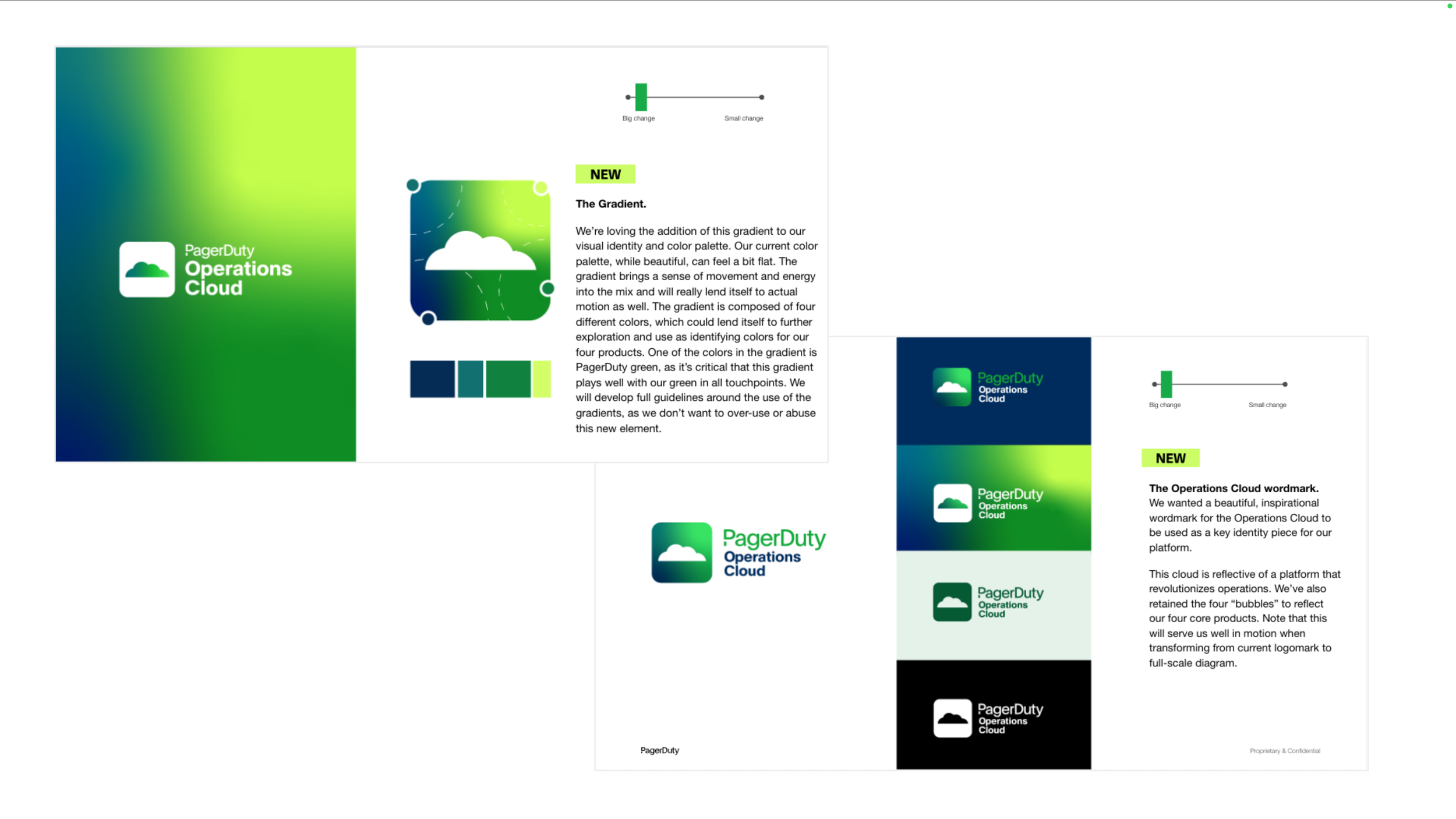
The refresh needed to:
Reflect our shift from product to platform
Build relevance with senior buyers and enterprise audiences
Tell the story of the Operations Cloud in a way that resonates deeply
Modernize our identity while staying true to who we are
Make the brand feel more human, approachable, and differentiated
The Approach & Execution:
Rather than starting from scratch, we evolved the existing brand system to better reflect who we are today, and where we’re headed. The goal was to modernize and elevate without losing the equity we’d built.
This refresh was executed entirely by the in-house Brand team, we refined the visual identity to be cleaner, more confident, and more flexible across touchpoints. We introduced a more editorial type system, elevated the role of photography, simplified our use of color, and gave layouts more room to breathe. We also softened some of the brand’s rigidity, allowing for more human moments to come through in imagery and voice.
I led the refresh from strategy through rollout—aligning with cross-functional stakeholders, guiding creative development, and ensuring the new system could scale across teams and regions.
The Impact:
The refresh gave PagerDuty’s brand a modern, elevated look that better reflects our evolution as a platform company. It provided a key opportunity to re-engage internal teams and agency partners with updated tools, clearer guidance, and renewed creative energy.
We rolled out updated brand guidelines and templates company-wide, enabling consistent application across all internal and external touchpoints including web, advertising, content, communications, and product. The refreshed system brought new clarity, cohesion, and confidence to how the brand shows up in the market.